Thursday 25 October 2012

Unit 2 Evaluation


I believe that creativity was one of my main strong points during the course. I always stuck with initial ideas and developed them accordingly, with a firm view in mind of what I wanted to do and how I was going to do it.
I believe I was at my most creative when writing my music video treatment, using descriptive words to set a particular scene, as well as to describe shot angles and emotions.
My wide vocabulary and creative imagination were a big help to me during the course, and I always had a very firm picture in my mind of what I wanted. I encountered very few problems with the more creative side of the course, my only hindrance being that sometimes my ideas were to bold to be created with the materials and sources I had to hand.

Near the beginning of the course, I didn’t take as much care over work as I did later on, mostly because of my inexperience with the equipment and systems used and my reluctance to share my ideas. I overcame this by learning to use the equipment, the skills for which were slowly gained over the course of the year and were applied as I went along.
Once I became familiar with the Mac books, using them became easier and I became more skilled with programs and software like Photoshop and Garageband.

The Mac books were a new concept, as well as a number of systems on them that I had not come across before, such as Garageband and Photoshop.
Near the beginning of the course, I struggled to use the Mac books and the systems on them, but I overcame this through repeated use and experience.
I was helped repeatedly by my teacher and T.A, who were more than willing to help me overcome my inexperience with the software.
As I gained experience with the equipment, it became less of a hindrance and more of a useful tool, and my skills with programs like Photoshop have improved vastly since the beginning of the year.

Saving and storing material and documents proved a problem at the start of the course too. Saving documents and files to the wrong places or to the desktop meant they weren’t there next time I logged on, or simply could not be accessed from other computers.
I overcame this by choosing to save important material to my USB stick instead of to the computers.
Using my USB allowed me a chance to order my work and sort things into subjects and units for easier storage. I was encouraged to type essays and documents on Google Docs, or even straight onto the blog. Although I rarely did this, I still feel my experience in this field has improved since the start of the year.

I believe my strongest skills were my creativity and my use of grammar.
My creativity meant that my initial idea for projects was usually my best, and almost always ended up as the final product with a bit of alteration.
Creative writing has always been a passion I like to indulge with, and the amount of creative freedom over the course of the year allowed me to express myself in more than a few areas.
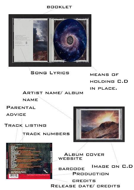
Once I had mastered systems such as Photoshop, my visual creativity was also allowed to shine through in more practical products, such as my C.D cover and packaging, which was a big leap forward in terms of my Photoshop skills.
My use of grammar meant I could use a wide range of descriptive words to accurately describe what I wanted to say.
I excelled in more practical work due to my use of grammar in my documents, using formal and informal language respectively where they were required, and making good use of my wide vocabulary.
My feedback summary, my Music Video Treatment and my Questionnaire all relied on my use of good grammar to make a rigid structure that I could work from.

The only skill that I think needs improving is my use of systems like Garageband and Photoshop, which, although I have familiarized myself with them, I still feel I could benefit from improving.
Though sheets detailing the keyboard shortcuts for Photoshop are commonplace, there are some techniques I still need to master before fully getting to grips with the software.
Garageband is still mostly unfamiliar territory.
Although I know the basics, I still need to do a fair bit of work before I fully grasp the software.

Friday 30 September 2011

AOB 4: Research Report: Music Video


1. Explain what you have been researching and for what reason?

The research i have undertaken has been to find out about the genres and conventions of music video, more specifically those of the band i decided to use in my own music video. I have used several research methods to find the information i need, including comparing music videos of the same genre, finding out why the artist or director set the music video as it is, and researching the artist's history to find any correlation with other music videos.


2. What were the findings from the research?

My research findings helped me understand more of the band i decided to use and the genre of their music, looking extensively at their music videos, i also discovered reoccurring themes, such as band performance mixed with narrative, played a large part in several of the band's music videos, with a few being entirely performance based. The band uses very dark settings as their backdrop, and reoccurring themes are usually also dark and foreboding.

3. How will these findings affect your idea?

With these findings, i will be able to judge more accurately what should go into the music video and what conventions and themes should be included, such as the concept of performance mixed with narrative. It has also given me a clear idea of other assets the band uses, such as dark backdrops, commonly using gothic architecture, or locations with a distinctly abandoned look that compliments the band's style. I also plan to keep the band's style of interlinking the band's performance and the narrative, which makes the video seem more of a whole.

I will also be more open to the concept of representation, using the band's logo at several points during the video as seemingly insignificant iconography unless the audience looks closely.


AOB 4: group feedback summary


Group Feedback Summary

Following the presentation of my music video treatment, I handed out feedback questionnaires to be filled in and returned. I used a panel of six people to fill in the questionnaires and hand them back.
Following is the overall data I collected from the returned questionnaires.

I began by asking the audience if they thought the idea would be interesting for the target audience. Five out of six of my panel thought the idea worked because it had a good clear narrative that appealed to the target audience, one out of six of my panel simply said “yes”.

My next question enquired if they thought the idea was fully realised and if they got a clear enough picture.
All of my panel gave positive feedback, stating that the idea was clear and easy to read on my blog, with some commenting that the lyrics were emphasised within the proposal and the song.

Following this, I quite bluntly asked the panel, if they thought the idea worked. Three out of six of my panellists said it worked because the lyrics related to the meaning of the song and the video. Two said it conveyed a deep sense of emotional loss, and one didn’t answer.

Finally i asked the panel what they thought the best part of the idea was.
Four of the six said that the best part of the idea was the inclusion of the lead singer’s grandfather, who is the main focus of the video. Two replied that the best part of the idea was how the video was personal to the band’s lead singer.

Most of my panel didn’t see a problem with the idea, but one person replied saying that the video didn’t explain what the artist was trying to convey, and didn’t talk about previous videos.

Conclusion
From my feedback, which was positive for the most part, I have concluded that the idea appealed to my target audience and made for a gripping visual narrative, as well as conveying the mood of the video successfully.
I think this is mainly due to the inclusion of the lead singer’s grandfather, and the links between this, the lyrics and the visuals.

Thursday 29 September 2011

AOB 4: Questionnaire

questionnaire feedback: Wordle

AOB 4: Goodwyn music video analysis

1) Artist & Track Name: Breaking Benjamin - Polyamorous

How are genre characteristics used/ subverted?
The video features a lot of voyeurism, with a couple sitting at a bank of computers and spying on various other people through CCTV.
This represents the idea that there is no privacy in modern life, and that anyone could be watching.
In this way, the genre characteristics that the band normally uses (dark settings, underlying themes) are established quickly near the start of the video.

What is the relationship between lyrics and visuals?
The lyrics and the visuals share very little in common, with the lyrics refer to the concept of submitting to more base instincts while claiming that your morales are higher (referring specifically to the lead singer's alcoholism), and the visuals painting a picture that no-one in modern life is truly alone, and that anyone could be watching you.

What is the relationship between music and visuals?
The music keeps a steady beat, using elements of alternative metal and growled vocals that swell into a heavy intro at the chorus.
The beat keeps time with the cuts from shot to shot, whilst the music video really comes into its own once the beat increases at the chorus.

Are there close-ups of the artists and star image motifs?
As well as featuring voyeuristic imagery, the video is interspersed with shots of the band playing in a disused swimming pool with a cage around them.
The band's symbol, a Gaelic Knot shaped by four capital B's linked together, can be seen in various places throughout the video, such as on tables or walls.

Is there reference to the notion of looking? Where?
At certain parts of the video, the various band members can be seen in the various rooms of the people featured throughout the video, playing their instruments but seemingly unnoticed.
At one stage of the video, the lead singer looks directly at the camera and says "But how do you know?"
His moth and eyes then fill with static energy and the camera shoots forward into what seems to be a synthetic (mechanical) reconstruction of a person's throat.

Are there any intertextual references?
An alternative version of the music video was released shortly after the original, featuring clips from the video game Run Like Hell: Hunt or be Hunted.

Is it performance-based, narrative-based or concept-based? How much of each?
A majority of the video is a mix of performance and narrative-based ideas.
This is true of a lot of Breaking Benjamin songs, though in this case there is an underlying conceptual theme of being watched by someone who is unknown or not acknowledged.


2) Artist track & name: 30 Seconds To Mars - The Kill (Bury Me)

How are genre characteristics used/ subverted?
The cinematography used makes use of the split-screen effect near the end of the video, and also uses rapid cuts between shots.
The band's habit of making subtle references to real world culture or ideas is apparent in the numerous references to the film The Shining.

What is the relationship between lyrics and visuals?
The relationship between the lyrics and the visuals is one that is dictated by the themes of the video, which focusses heavily on the idea of evaluating your own personality and determining your faults.
The lead singer relates to his own experiences with the band, such as being in the public eye, characterized by the lyric "Come break me down".
The visual representation in the video comes in the form of the dopplegangers the band members encounter.

What is the relationship between music and visuals?
In the video, the music serves to emphasize what is going on in the video, such as the abrupt silences when the screen cuts to a typewriter with the words "This is who I really am" typed over and over again on the page, mimicking the film The Shining, where the same thing happens, except with the words "All work and no play makes Jack a dull boy" in place of the song lyrics.

Are there close-ups of the artists and star image motifs?
The video cuts between the narrative of exploring the hotel, and various shots of the band's doppelgangers playing on a stage in a ballroom.
The number 6277 appears in a close-up of one of the hotel rooms that one of the band members enters, which on a telephone keypad spells "Mars", and also serves as a reference to The Shining, where the main characters are told to stay out of room 237.

Is there reference to the notion of looking? where?
Jared Leto, the band's lead singer, sings portions of the song's lyrics as he explores the hotel, most notably when he slams his doppelganger up against the wall when they meet, shouting the lyric "This is who I really am!" at himself.
At the very first line of the video, Leto looks directly at the camera, saying the lyric "What if I wanted to break?" as he raises his head.

Are there intertextual references?
The video is heavily based off the film The Shining, using a similar setting, and similar ideas, such as the doppelgangers that appear when one of the band members enters room 6277.
Several other scenes, such as when Matt Watcher encounters a mirror image of himself, who serves him a drink at the hotel's bar, and when Jared Leto types "This is who I really am!" over and over on a typewriter, mimicking a similar act performed by one of the characters in the film.
The part of the video set in the ballroom at the end is also reminisce of a photo featured at the end of The Shining, which features people dancing in a ballroom with clones of themselves.

Is it performance-based, narrative-based or concept-based? How much of each?
The video is primarily narrative-based, and follows the plot of The Shining loosely, with many of the events occurring in the film happening to the band members as the video progresses.
The video is also concept-based, focussing on the concept of facing your true personality, and coming face-to-face with the worst aspects of your personality.


3) Artist & Track name: Linkin Park - Burn It Down

How are genre characteristics used/ subverted?
A lot of the band's iconic, long-standing alternative rock roots feature heavily in the video, mixed with their newer, more "electro" beat and imagery.
The video also characterizes how the band has grown since their formation.

What is the relationship between lyrics and visuals?
The lyrics and the visuals have no relationship.
The lyrics refer to the effect of pop culture on celebrities and artists, and how audiences build up a certain expectation of those artists, and are then disappointed when they do something wrong or are suspected thus, or are accused by the media.
The visuals refer to how hard the band are worked and the stress that fame puts on them, to the extent that they burst into flames near the end.

What is the relationship between music and visuals?
The music ties the song together, keeping time with the visuals and making the heavy, electronic beat match the pace of the music video.
the faster the beat gets, the more quick cuts feature in the video.

Are there any close-ups of the artists and star image motifs?
The video is completely performance based, featuring close-ups of the entire band playing and singing.

Is there any reference to the notion of looking?
There is very little relation between the band and the camera, the only one being when the two lead vocalists sing whilst looking at the camera.

Are there any intertextual references?
No, the band rely completely on their performance to promote the video and the music, with the only real intertextuality relating to their previous videos and promotions.

Is it performance-based, narrative-based or concept-based?
The video is entirely performance-based, with visual effects dubbed in such as the band bursting into flames and static electricity surrounding them.

Wednesday 28 September 2011

AOB 4: looking at music video


AOB 4: Transferrable skills


AOB 4: Research Report:C.D conventions


1.   Explain what you have been researching and for what reason?

For this task, I have been looking into C.D designs, album covers and art by different artists/ bands in the Grunge and metal genres, for the purposes of designing my own fictional band and album. To make it as realistic as possible, I looked at cover conventions commonly used by artists, more specifically those used by bands such as Linkin Park, 30 Seconds To Mars, and Breaking Benjamin, as these are the bands that I have drawn inspiration from for my own album. I want the album to have a very black-white feel to it, with an overshadowing dark feel to it. To this end, i feel like i have chosen the bands i will take inspiration from well, as their reoccurring themes tend to be darker than those of most mainstream bands. This kind of music is a point of interest for me because it is seperate from the mainstream, effectively breaking with the convention that the public have become accustomed too.

2.   What were the findings from the research?

After a fair amount of internet-based research, I found a particular set of conventions that all C.D’s and albums seemed to follow. These were mostly tailored to advertising, branding and security measures. Album covers tended to use very few colours, rarely featuring pictures of the band or artist, instead using logos, iconography or even landscapes to identify the album.
Album covers in the specific genre I was researching also had specific conventions, commonly including only one image either filling the cover or used against a background. Text was usually simple and easy to read, and most of the imagery was dark or grim. This kind of iconography matches with the bands i want to use for research. Although some, such as 30 Seconds To Mars, use colours like red and white, which, although they aren't openly grim like other, darker colours, are still made to have the same effect when used with the band's iconography.

3.   How will these findings affect your idea?

Conventions such as dark imagery and a single-image motif on the album cover and more common conventions such as barcodes and QR codes were amongst the things I have considered using in my design. These are obviously important to the product as they denote it as a consumer product that can be brought. I have also discovered, upon further investigation, that some album covers aren't limited to simple black and white, but instead use other dark colours, blue and red being amongst the most common. These features are more common amongst grunge bands like Breaking Benjamin than they are amongst bands like Linkin Park and 30 Seconds To Mars, the former of which tends to use simple blacks and whites, and the latter using primary bright red and white.
To this end, Breaking Benjamin has become my main inspiration and the driving point for my current concepts.

AOB 4 - Presentation feedback: CD covers

When I presented my CD covers to the group, the feedback I got was mostly positive.
People commented on how the imagery and colour palette matched their expectations of the band, and reinforced the idea that the band were a hardcore post-grunge band with a reputation for dark lyrics.
Also commented on was the use of simple, dark colours blended with stark whites.
Colours like navy blue were used to highlight white text, against a background of black and white, which was well received by the audience, and was speculated to be well received by its target audience.

The group did comment, however, that none of them would buy it, as they weren't the target audience and the genre didn't interest them.
They also stated that the use of the fully-coloured plague doctor against the contrasting background ruined the cover's continuity a little.
They also noted that the shades of blue used on each face of the album cover, including the back, were slightly different shades to each other.
This also mucked up the continuity a little.
Another problem was the fact that the track listing was on the inside of the cover, instead of on the back, which could cause problems, as potential buyers don't know what they are purchasing.

Despite all this, my album cover was well received by most, and got positive feedback for the most part.
Most of the problems cited were to do with the album's continuity, and assured that, if a few changes were made, the album would sell well with at least its target audience.

Wednesday 21 September 2011